This release of Components brings you an improved UX – and improved documentation - for building styles and applying them to individual elements and components as a whole.
These improvements include:
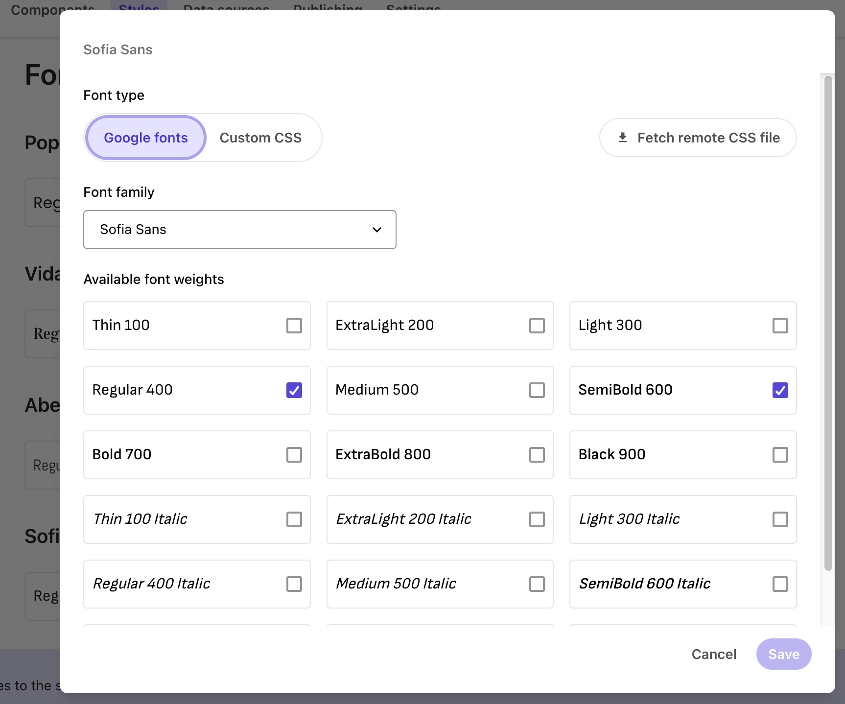
In Styles, we’ve reduced the size of UI elements to provide a better overview of the style you’re working on.
In the Components builder, the right-hand pane has been redesigned to make it easier to apply and customize themes and styles.
A new button invites you to add components, styles, and data sources if the collection has none.
A Manage account shortcut to XM Cloud Portal has been added to the profile menu in the top-right corner of the app.
Duplicating a component now appends the word “copy” to the duplicate’s name, to better differentiate it from the original.