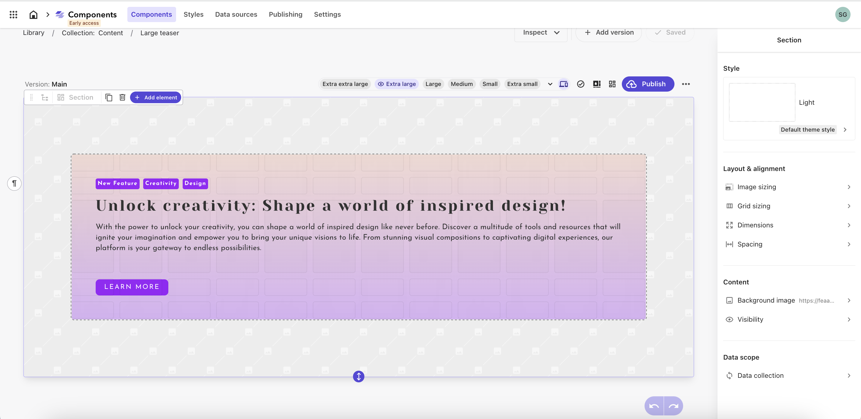
A new release of Sitecore Components, still in Early Access phase, includes significant UI improvements, support for using external React components, and easier component creation flows with a new grid and right-hand menu.
To get the latest features, update your application to use the latest versions of the @sitecore-feaas/clientside and @sitecore-jss/* packages:
@sitecore-feaas/clientside 0.3.6 or later
@sitecore-jss/* 21.2.0 or later
Additionally, developers need to manually update changes from the starter foundation in their application.
Release highlights:
New configurable, responsive grid layout in the component canvas for drawing, resizing, and rearranging containers within a component.
Improved Component builder user interface and features.
Right-hand bar for managing all Component configurations
New data picker and item picker.
New Settings tab for configuring library sharing, registering React components, and integrating with Content Hub ONE
A new release of Sitecore Components, still in Early Access phase, includes significant UI improvements, support for using external React components, and easier component creation flows with a new grid and right-hand menu.
To get the latest features, update your application to use the latest versions of the @sitecore-feaas/clientside and @sitecore-jss/* packages:
@sitecore-feaas/clientside 0.3.6 or later
@sitecore-jss/* 21.2.0 or later
Additionally, developers need to manually update changes from the starter foundation in their application.
The release includes:
New configurable, responsive grid layout in the component canvas for drawing, resizing, and rearranging containers within a component.
Component builder features:
Background images can be applied as a setting
Inline elements (buttons, badges) can be nested in text elements
New spacer element to expand to all available space in a component layout
Support for data mapping of HTML within text elements (strips text HTML tags, like paragraphs)
Extended code embedding dialog includes support for external React components, typescript support, and preconfigured data fetching.
New right-hand bar:
Overview screen with link to documentation, version status, alerts when versions use different data sources, and more.
Element configuration is now managed on the right-hand side, including themes and styles, layouts, dimensions, spacing, and links.
Components now fetch their own data on runtime in Pages
New data picker in the right-hand bar when selecting an embedded component
Better integration when picking data from XM Cloud
Components using 3rd party data will auto fetch from the configured data source
Users can update the data source URL, HTTP method, parameters, and headers.
Data item picker allows configuring repeat limits and picking specific data items from an array
Content Hub ONE data sources show up automatically when their API key is configured
New Settings tab that allows users to -
Name their component library
Enable library sharing
Register external React components and configure their preview rendering host
Configure a Content Hub ONE API key to use as a data source
Register custom React components
Other user interface updates
New icons
Simplified context toolbar, element types and custom elements
Grids are enabled for sections
Improved Pages interface for using Components
Variable elements are now configured with the same tools as other elements
